Introduction: Accessibility Starts with Colour and Branding
In today’s digital-first world, creating an accessible website isn’t just a best practice — it’s a requirement.
While many organizations focus on screen reader compatibility or mobile responsiveness, colour and branding choices often get overlooked. Yet these elements directly affect how easily users — especially those with visual impairments — can navigate and interact with your website.
Done right, accessible branding enhances user experience, strengthens brand recognition, and meets legal standards.
1. Understanding Web Accessibility
Web accessibility means designing websites so people with disabilities — including visual, auditory, motor, or cognitive impairments — can use them effectively.
The market impact:
- Over 1 billion people worldwide live with disabilities (WHO).
- That’s 15% of the global population — a massive potential audience your site could serve.
2. The Role of Colour in Accessibility
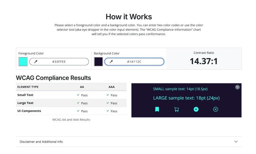
Colour Contrast
Poor contrast between text and background can make content unreadable for people with low vision or colour blindness.
WCAG guidelines recommend:
- Normal text: 4.5:1 minimum contrast ratio
- Large text: 3:1 minimum contrast ratio
- UI elements/graphics: 3:1 minimum contrast ratio
Tip: Use tools like the WebAIM Contrast Checker to verify compliance.
Colour Blindness Considerations
Relying solely on colour to convey meaning excludes millions of users:
- Deuteranopia — red-green blindness
- Protanopia — another form of red-green blindness
- Tritanopia — blue-yellow blindness
Example: Don’t mark form errors only with red text — pair with icons or descriptive labels.
3. Branding and Accessibility — Finding the Balance
Accessible design doesn’t mean abandoning brand identity. Instead, expand your colour palette to include accessible variants of your primary brand colours.
Strategies:
- Darker shades for light backgrounds
- Lighter shades for dark backgrounds
- Neutral tones that pair well with your brand colours
4. Typography for Accessible Branding
Text design is as important as colour:
- Choose legible fonts at multiple sizes
- Avoid overly decorative fonts for body text
- Maintain 16px minimum for body copy
- Ensure proper line height and spacing
5. Best Practices for Accessible Branding
- Never Rely on Colour Alone
- Use icons, patterns, or labels alongside colour indicators
- Test Regularly
- Contrast analysers, colour blindness simulators, screen readers, and user testing with disabled individuals
- Include Accessibility in Brand Guidelines
- Document compliant colour combinations, typography rules, and alt text requirements
- Offer Dark Mode
- Adapt brand colours for light sensitivity and eye strain reduction
6. Legal and Business Reasons to Prioritize Accessibility
Legal Requirements:
- US: ADA & Section 508
- EU: European Accessibility Act
- UK: Equality Act 2010
- Australia: Disability Discrimination Act
Business Benefits:
- Reach up to 20% more users
- Improved SEO from accessibility-friendly code
- Better UX for all visitors
- Positive, inclusive brand reputation
7. Case Studies: Brands Doing It Right
Microsoft: Inclusive Design principles integrated into branding and UI.
BBC: High-contrast modes and accessible colour choices without losing brand identity.
Conclusion: Accessibility Is Brand Strength
Accessible branding isn’t about limitation — it’s about designing with empathy.
When your colours, typography, and brand elements meet accessibility standards, you:
- Welcome a larger audience
- Strengthen brand trust
- Protect against legal risk
- Deliver better user experiences for everyone
Accessibility isn’t a one-off project — it’s an ongoing commitment. And when done right, it elevates both your brand image and your bottom line.